Indiana Review Redesign
Practicing long-form book design in collaboration with IU’s Indiana Review
Redesign Direction
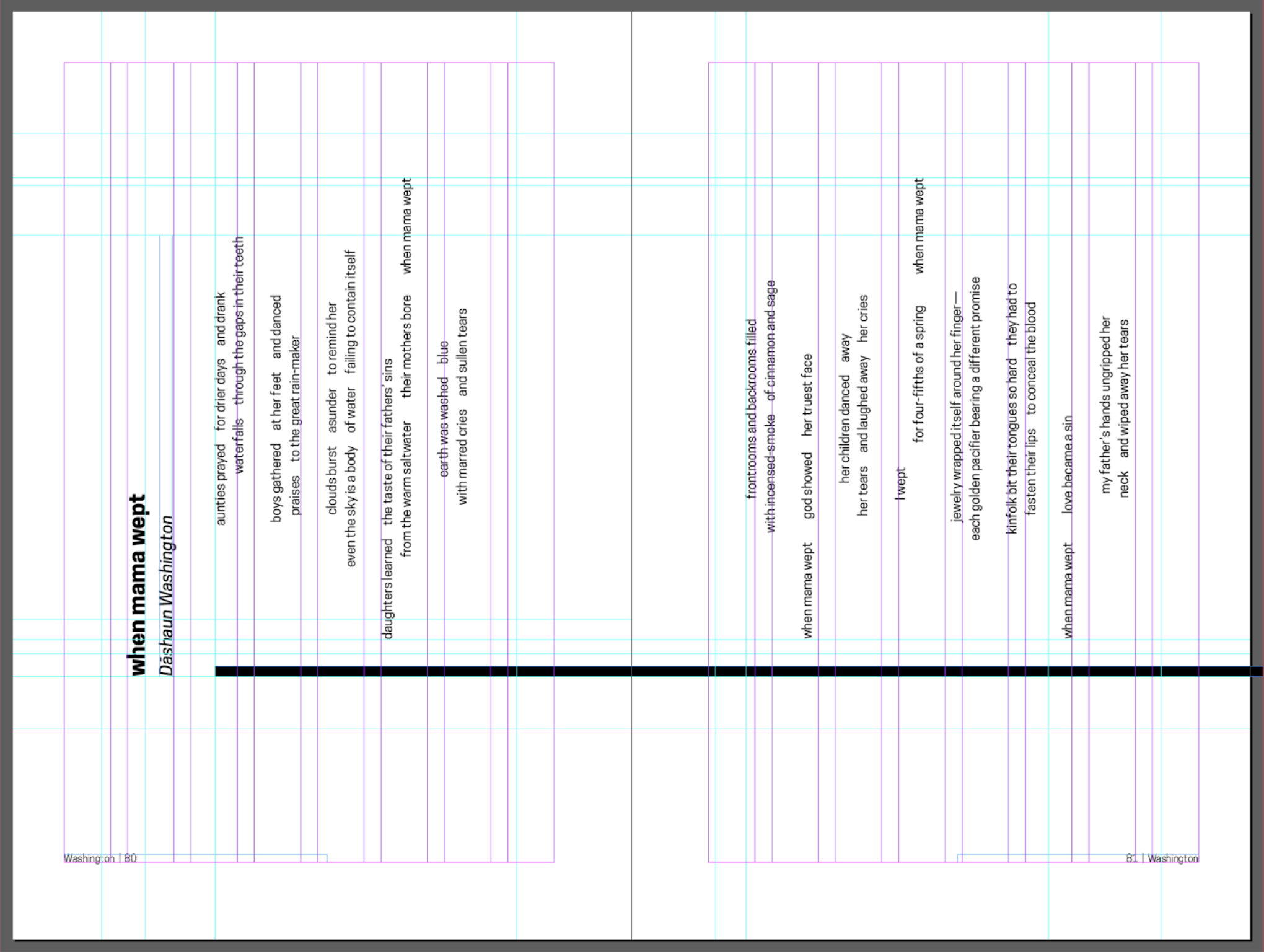
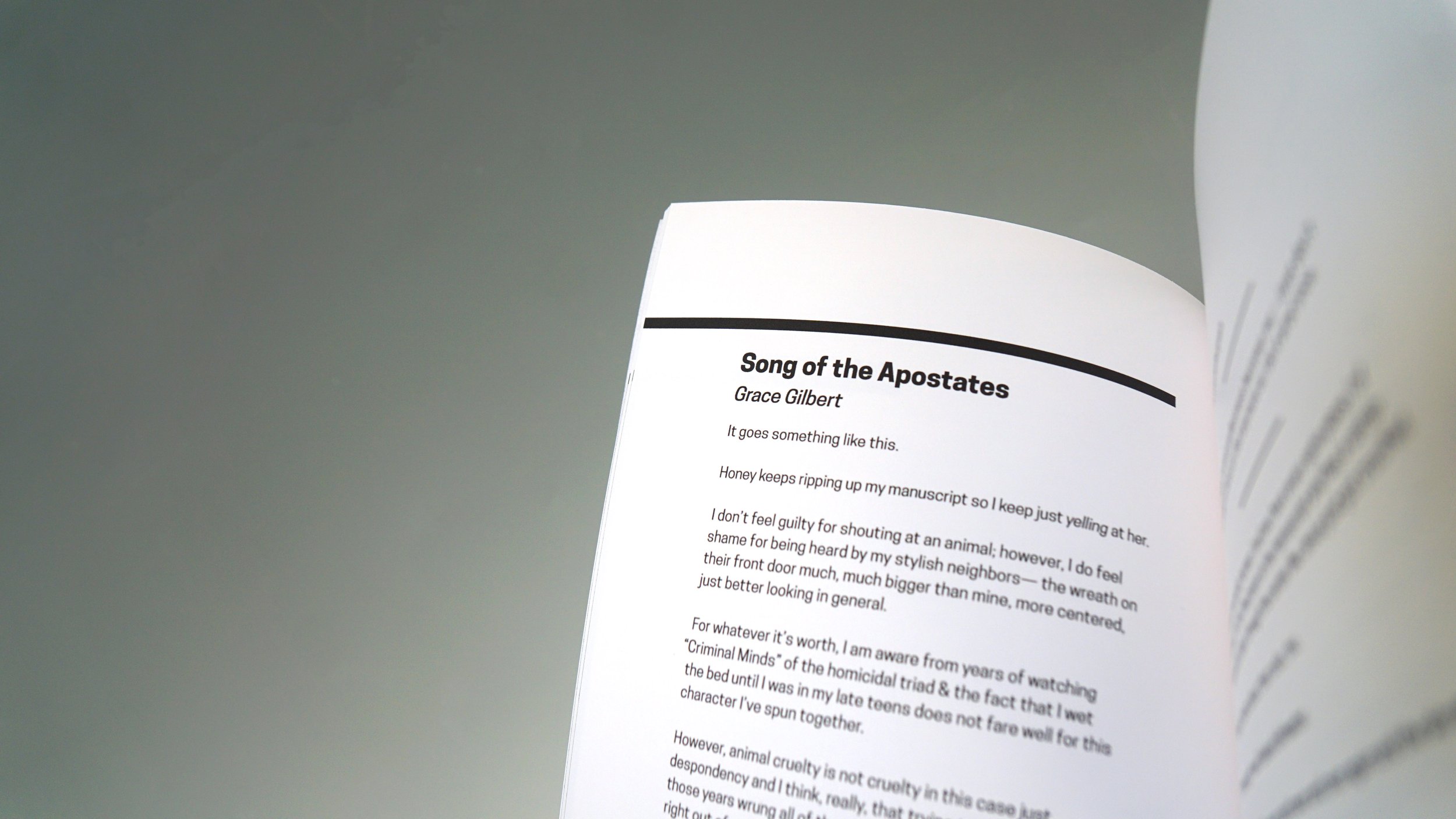
After skimming through the old designs, my partner, Isabelle, and I decided that the IR book needed significantly more white space. We also wanted the book to become a product that was aesthetically pleasing to the eye, hence the minimalist design. Additionally, we wanted our cover to be eye-catching and interactive; thus, we chose to incorporate a die cut. Internally, our grid also had to be very flexible to allow for future designers to play around with the typesetting. Isabelle took the lead on the logo redesign, and I turned my attention toward setting up our base grid and typesetting the stories, given my expertise in InDesign.
Redesign Elements
Logo | Typeface
The Logo
After many iterations, we settled on a simple, blocked out symbol form that utilizes our typeface. This logo exists in perfect harmony with our minimal internal design and has great scalability.


