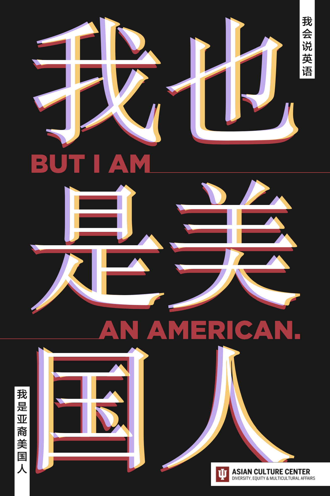
“I AM” Poster Campaign
You are many, many things, but a stereotype is not one of them
Poster Components
Typography
I knew I wanted the two primary typefaces to be very different in order to hint at the duality of Asian American identity. I also wanted a strong impact from the English text, which is why I chose a bold sans serif like Gotham. The Chinese typeface is much more elegant and adds to the lockup.
Color Palette
I chose colors that have a connection to the Chinese provinces where my parents were born. The lavender color is connected to the famous lavender (薰衣草) fields in northern Urumqi, which is where my mother was born. The rosy red color is connected to the popular peony (牡丹) flower in Luoyang, which is where my father was born. Lastly, the honey yellow color is connected to the traditional color of luck in China, a golden yellow.
Overall Design Concept
All the Chinese characters are overlapping to hint at the idea that one’s identities are not mutually exclusive. I also kept the secondary Chinese phrases untranslated in order to keep a little secret between me and a Chinese or ABC audience to help us feel heard.


