Our Logo
Typefaces | Color
The Path.
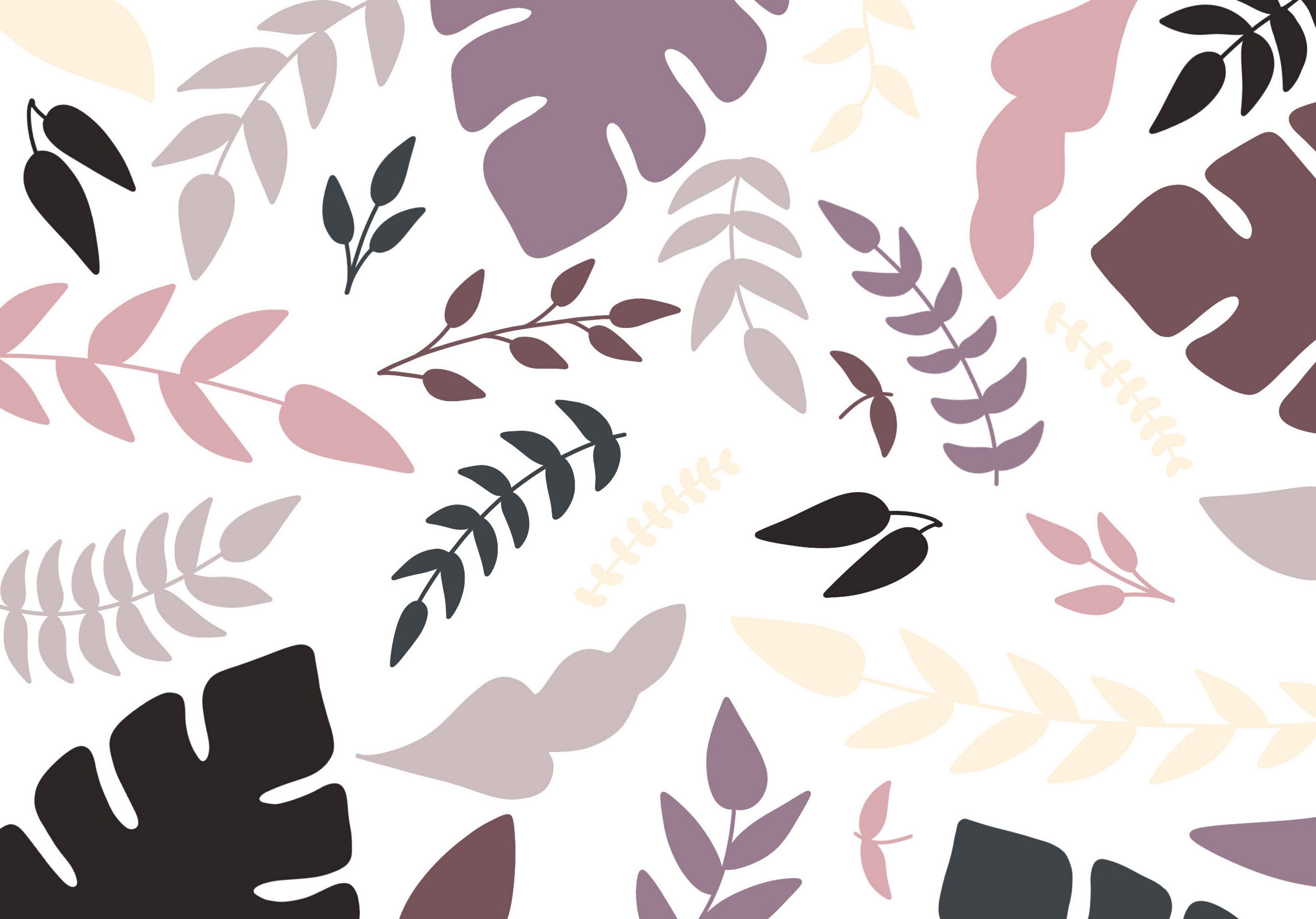
Throughout the design process, we knew we wanted to project minimal and modern aesthetics. Moreover, we wanted to find ways to hint at the action of “pressing on” nails in our logomark; thus, we settled on a simple logo that incorporated a “stacked” company name and bold period. In order to also convey modern yet elegant aesthetics, we chose to stick with mostly geometric or solid floral patterns. We also created another logomark that incorporated a minimalist hand.
The Hand.
The hand was created out of the desire to have a stand-alone icon for the Pressed On. brand. Because we wanted to pursue a more minimalist and geometric graphic language, we first used solid colors; however, we ran into the issue of potentially calling out a race, which was something we wanted to avoid. Moreover, there were issues with the shape of the hand and flower. These issues were solved by (1) changing the solid hand to an outline that matched the line weight of our text (2) shifting the angle of the flower and (3) reshaping the petals.
Primary Logo
Secondary Logo
Logo Misusage
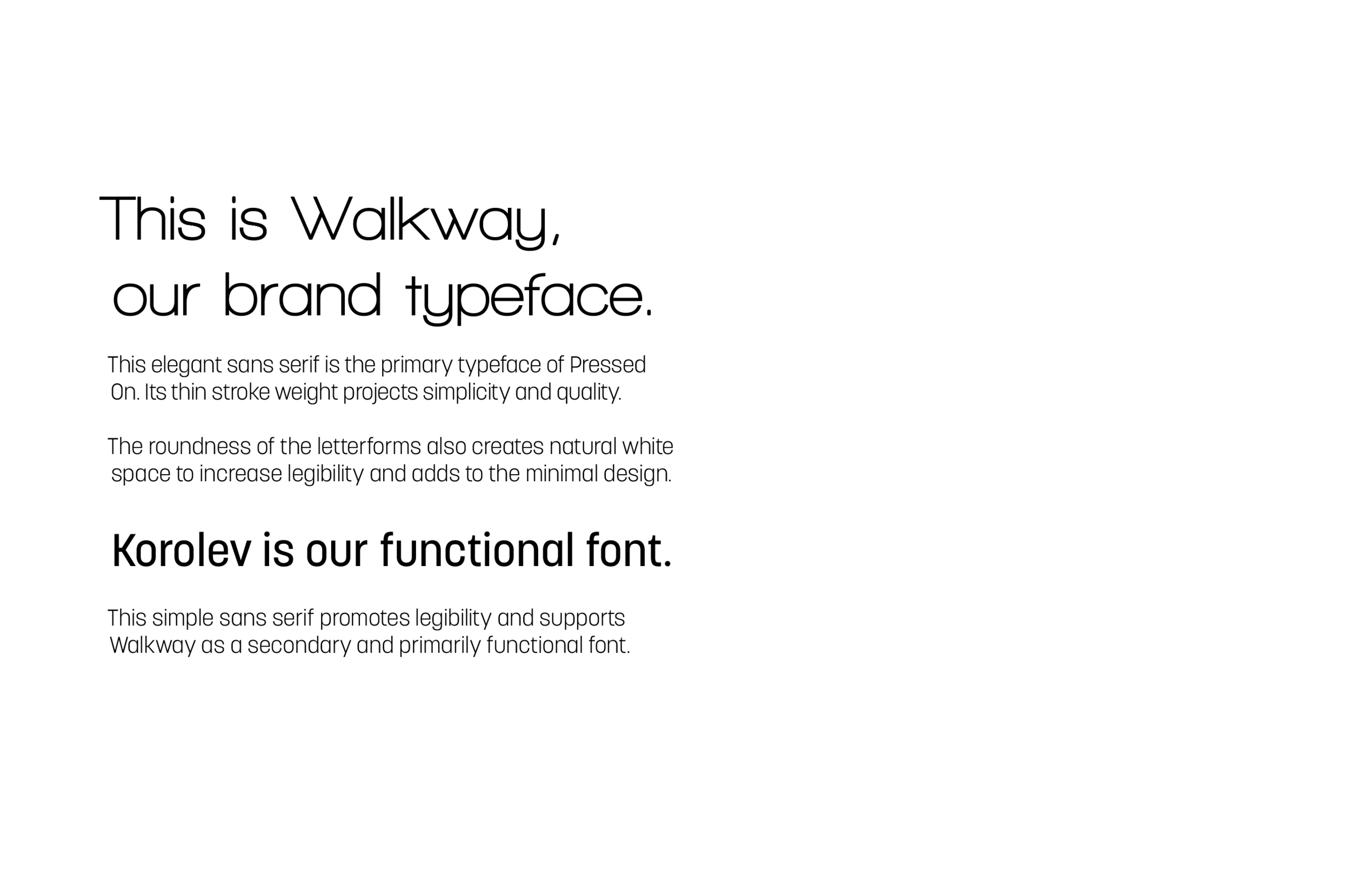
Typography.